Tapsta
SectionsOverview
Move Over PayPal: Building a Fintech From Zero, Through Two Pivots and One Apple Rejection
- Timeline
- April 2023 to September 2024
- Role
- Founding Product Manager (first employee)
- Project
- Turning a startup concept into an app, identifying a unique market, and turning it into a six-figure company.
- Tools
- Figma
- React Native
30-second version
- THE MESS
- I was recruited by co-founders looking to bring their idea of a next-gen fintech company to life. Six months later, we created Tapsta, an app designed to revolutionize peer-to-peer mobile transactions using NFC technology, blending social networking with financial transactions. However, our team faced a major roadblock when Apple blocked our app because our NFC feature competed with Apple Pay. This forced a pivot: instead of just a financial app, Tapsta would become a social platform for college students, combining financial transactions with social experiences.
- THE BET
- I rebuilt the strategy twice, from a payments app, to gift cards, to a campus social app that gave local businesses a shot against the chains.
- RESULT
- 97 high-fidelity screens, 100+ interviews, three campuses tested, a pre-seed team with a real product to show. 455 people signed up for the launch.
- 97screens
- $1.5Minitial startup valuation
- 455pre-downloads
- 3campuses
0 to 1
Two co-founders wanted to build next-generation fintech: peer-to-peer payments using NFC, with social built in.
They had the "what" but not the "how." I was the first and only person on the team with UX skills, so turning an abstract idea into a product and a brand fell squarely on me. Let's build 0 to 1.
Niche down
From vision to viable product in 14 days.
Mapped user flows, created 24 low-fidelity screens in 48 hours, and validated the core experience through daily user tests. Built clarity where none existed.
Validate everything
A/B tested features. Real feedback. Real pivots.
Led iterative testing across 3 campuses: University of Michigan, Penn State, University of Colorado Boulder. Validated product-market fit and pinpointed our key differentiators from other college-centered apps.
Move fast
97 high-fidelity mockups built for dev handoff.
Used Figma to create responsive, component-based screens ready for dev, demos, and investors.
The brand: electric on purpose
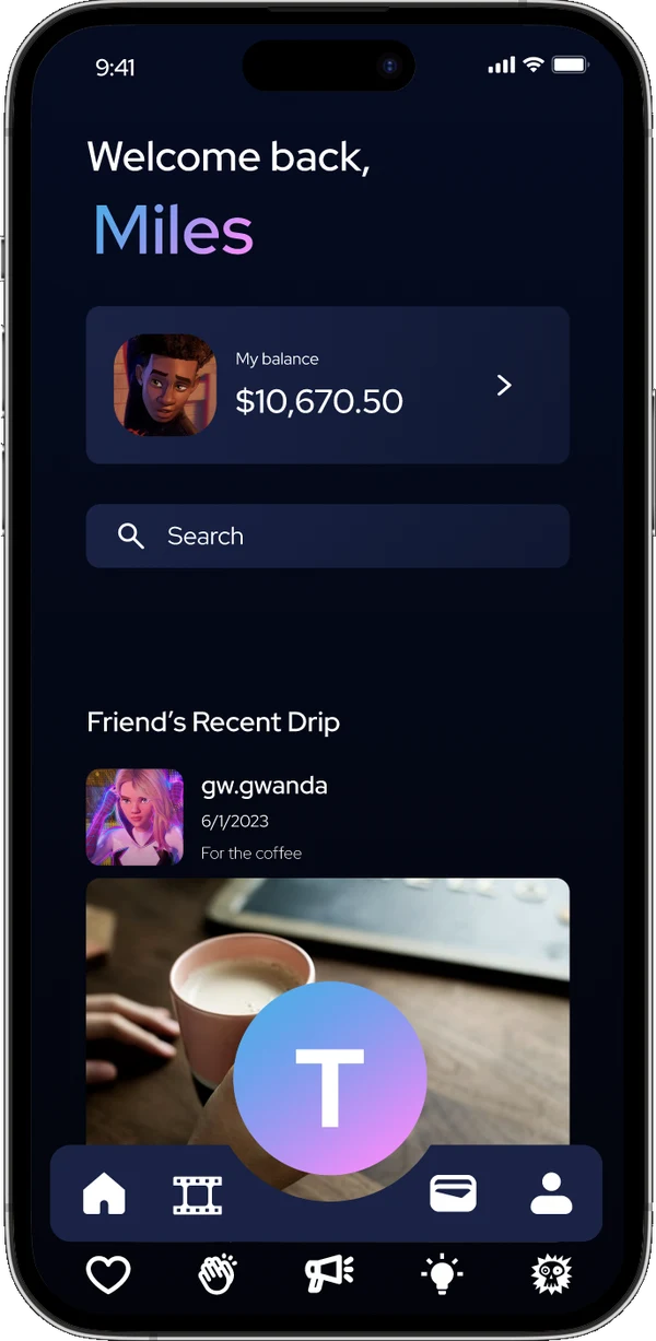
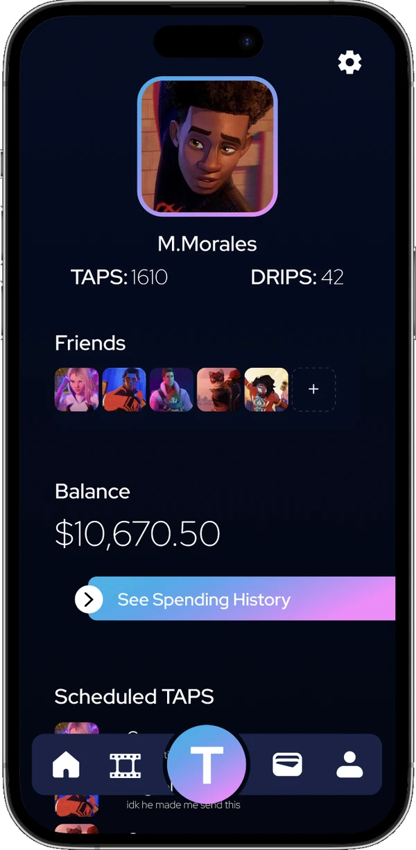
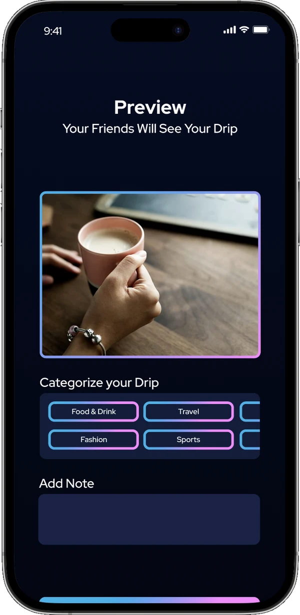
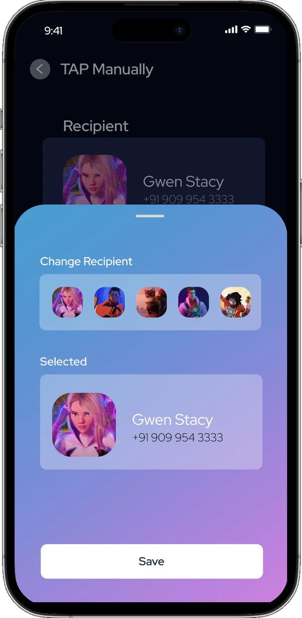
No basic whites and blues. Swipeable cards, playful toggles, neon pops. A UI that says "you've never used money like this before."
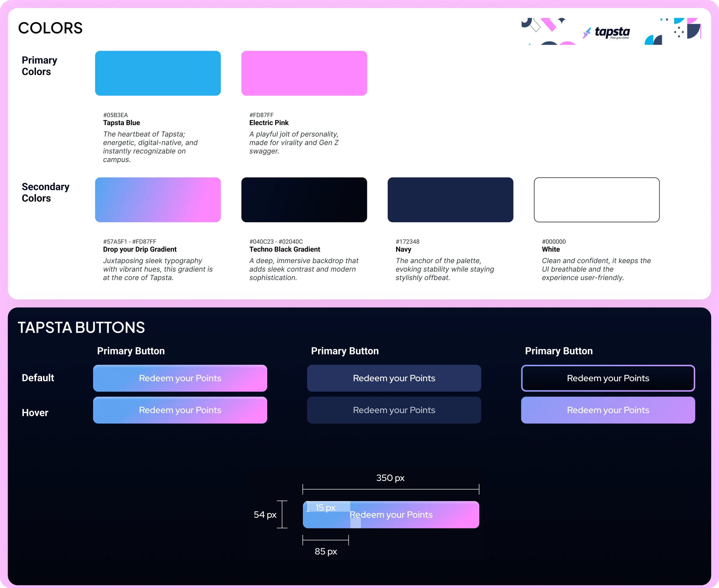
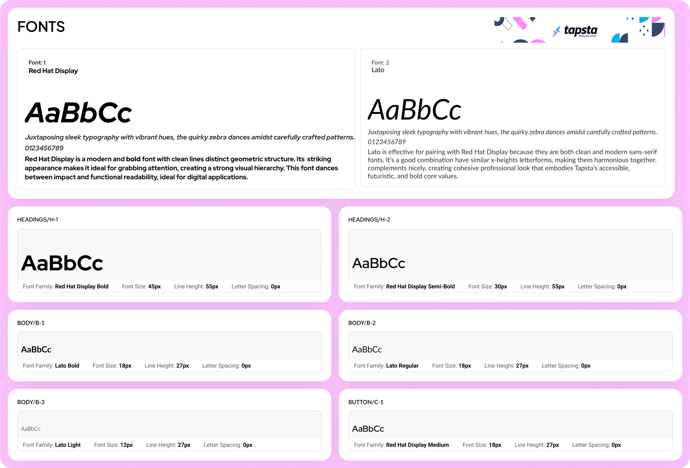
Red Hat Display for loud headlines, Lato for readable detail, an accessible high-contrast palette, three breakpoints. Playful rebellion meets tech authority. (Credibility and chaos, something your bank definitely doesn't know how to do.)
Then Apple blocked Tapsta from the App Store
Our NFC tap feature competed with Apple Pay. We had to pivot.
v1
NFC payments
Pivot 2
Campus social app
The pivot
01. College-specific feed
Users struggled with understanding the app's feed structure, which didn't feel personalized enough to their campus life.
Introduce a more targeted feed based on users' universities.
- Used a clean and simple layout, prioritizing recent trends and "Taps" relevant to the user's specific college community.
- Ensured the feed could be filtered by various categories, such as trending, friends, or college-specific events.
- Added a "Join the Trend" button, enabling users to participate in daily trends that showcased their creativity.
02. Integrating B2B
Local businesses weren't effectively integrated into Tapsta, and users weren't fully engaged with the merchant offerings.
Integrate location-based rewards and offers for college-town businesses.
- Create a separate merchant dashboard and user persona.
- Prioritized clear, visually appealing offers directly on the home screen.
- Used geolocation services to highlight nearby merchants offering exclusive student deals 24/7.
- Designed a simple flow where users could claim rewards by earning points from interactions with the app and merchants.
03. Increased personalization
The Home screen felt too generic and didn't excite users about what Tapsta could do for them.
Personalize the home screen with a "welcome" card and dynamic content.
- Added personalized greetings based on the user's profile and activity.
- Introduced a "Today's Trends" section that highlighted the most popular content for the day, encouraging users to interact with new content.
- Included quick access to their profile and rewards progress, making the Home screen feel like a true starting point for each user's journey.
04. Full gamification
Users wanted more engagement and competition with friends and across their campus, leading to a need for a social gamification element.
Create streaks with friends and a campus-wide leaderboard, along with competition between campuses.
- Designed a streaks feature that tracked consecutive daily interactions with friends, rewarding users for continued engagement.
- Created a campus leaderboard showcasing top users.
- Added a "Campus vs Campus" challenge where students from different campuses could compete, earning points and rewards for their school.
- Used visually engaging elements like badges and trophies to recognize and celebrate achievements, creating a sense of accomplishment.
The launch
- 455 people signed up for the launch.
- A $1.5M initial startup valuation.
- 97 high-fidelity screens handed to dev, component-based and ready for a React Native build.
- 100+ interviews (32 usability sessions) across three campuses.
- Two pivots and one Apple rejection, led from the design seat.
Waitlist stage. I helped pitch to three funds, gained two angel investors, and left in September 2024 before the final outcome.
- Activation: how many EDU sign-ups post their first Tap in week one.
- Retention: daily Taps per active student, campus by campus.
- The merchant side: offers redeemed per local business, and how many come back to post another.
- I turn an idea into a testable product, without compromising the vision.
- Research drives my decisions. These flows came straight out of 32 usability sessions.
- I pivot without starting over. The TAP interaction survived both pivots for a reason.
- I design both sides of a marketplace: students, and the local businesses trying to reach them.
- Engineers get files they can build from: components, three breakpoints, all accessibility reviewed.
I lived through 2+ idea pivots and made a pre-seed concept real before AI tools existed. I could do all of it in weeks now, not a year. Research synthesis, prototyping, and spec-writing collapse. Deciding which pivot to make does not, and I learned that part the slow way.
Building something from zero? I'd like to hear about it.
Contact me ↗